


Audi's Iconic Four-Ring Logo: A Symbol of Excellence and Innovation
I still remember the first time I stood nose-to-nose with an Auto Union Silver Arrow at the Ingolstadt museum. You don’t forget those shimmering circles. The Audi four-ring logo isn’t just a badge you polish on a Sunday; it’s a tidy piece of industrial storytelling. Four rings, four founders, one relentless idea: move the game on. And whether you spot it on an old Wanderer saloon in a coffee-table book or on the latest RS model stalking the valet line, the Audi four-ring logo carries a certain hush-it’s-here authority.

The Birth of the Audi four-ring logo: when four became one
Back in 1932—tough times, tough decisions—four carmakers pooled their strengths to survive and innovate: Audi for engineering precision, DKW for small-car ingenuity, Horch for luxury swagger, and Wanderer for hardy, inventive spirit. They called the alliance Auto Union. The emblem? Four interlocking rings, each one a chapter in the same book. Simple, honest, memorable.
Diagram: The four rings, at a glance
| Ring | Original Brand | Core Strength | Legacy in Today’s Audi |
|---|---|---|---|
| 1 | Audi | Precision engineering | Clean design, advanced drivetrains, restrained luxe |
| 2 | DKW | Small cars, efficiency | Smart packaging, lightweight thinking |
| 3 | Horch | Luxury and refinement | Quiet cabins, sumptuous materials, hushed long-haul comfort |
| 4 | Wanderer | Sturdy innovation | Durability, practical tech that actually helps on bad roads |
Why the Audi four-ring logo still matters
When I slipped behind the wheel of the latest S-line car on a rain-slicked B-road, I noticed the same thing I’ve noticed for 20 years: the rings do half the talking before the engine even turns. They signal consistency and capability. But that promise is earned, not granted.
- Heritage with purpose: A century-long thread from Auto Union’s daring to today’s quattro confidence.
- Design that evolves, not revolts: The logo has gone flatter and cleaner recently, but the message hasn’t softened.
- Unity you can feel: From base A3 to R8, there’s a shared calm to the way an Audi takes a highway groove—stable, quiet, confident.
- Recognition everywhere: In a dim parking structure or at a ski chalet drop-off, the four rings read instantly.
The Audi four-ring logo on the road: lived-in impressions
On a recent cross-country run, the family and I packed the hatch to the roof, ski rack on top, coffee in the cupholders. That familiar badge on the grille felt like a quiet contract—this will be comfortable, and it won’t do anything silly when the weather turns. True enough: the car was so hushed I could hear the kids arguing over playlists in the back. Progress?
Are there quirks? Sure. I’ve had infotainment freeze once or twice (a quick reboot fixes it), and the de-chromed “black optics” rings can look a touch anonymous on certain paint colors. But the overall message remains right: less shout, more substance.
Iconic emblems, side-by-side
| Brand | Emblem | Core Idea | Vibe on the Street |
|---|---|---|---|
| Audi | Four interlocking rings | Unity, engineering, quiet luxury | Understated confidence |
| BMW | Roundel (propeller myth, Bavarian colors) | Driver focus, sport | Sporty swagger |
| Mercedes-Benz | Three-pointed star | Dominion on land, sea, air | Classic prestige |
From grille to cabin: accessories that carry the Audi four-ring logo spirit
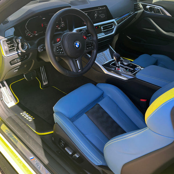
Little upgrades can keep that factory-fresh feeling alive. I’ve tried premium mats that fit like they were laser-measured—handy when your weekend turns muddy. If you’re personalizing an Audi cabin, AutoWin has been on my short list for tidy, durable pieces that survive real life (kids, snow, half-spilled oat lattes—no judgment).

Quick picks I look for in a premium mat
- Exact fit, preferably with factory-style retention clips
- Dense pile or durable rubber that doesn’t collapse after one salty winter
- Edges that don’t curl and trap grit
- Easy-to-clean backing (because gravel happens)
Curating accessories that match the subtlety of the rings is half the fun—think functional, not flashy. You can browse the broader collection at the AutoWin e-shop; it mirrors Audi’s own less-is-more philosophy quite well.

The Audi four-ring logo over time: consistency with quiet tweaks
What I love is how subtle the evolution has been. Fonts changed, finishes went from chrome to black to satin, and the latest two-dimensional interpretation suits today’s crisp lighting signatures. But the silhouette? Untouched. When you buy into those rings, you’re buying into consistency—an anchor amid the seasonal trends.
Conclusion: why the Audi four-ring logo still earns its place
In an era of screens, touch sliders, and over-the-air everything, the Audi four-ring logo remains gloriously analog—a small, metal oath to do things properly. It began as a survival pact and matured into a global design icon. And while I’m as guilty as anyone of chasing the latest horsepower stats, that tidy loop of history on the grille still grounds the experience. Four rings, one promise: progress, without the shouting.
FAQ: Audi four-ring logo
What does the Audi four-ring logo represent?
Each ring stands for one of the four companies that formed Auto Union in 1932: Audi, DKW, Horch, and Wanderer.
Has the Audi four-ring logo changed recently?
Yes—Audi has moved to a cleaner, two-dimensional version in recent years. The shape hasn’t changed, just the finish and presentation.
Is the Audi four-ring logo related to the Olympics?
No. The resemblance is coincidental; the rings reference Auto Union’s four founding brands.
Why do some Audi models have blacked-out rings?
That’s part of “black optics” styling packages. It swaps bright chrome for darker finishes to create a stealthier look.
Where can I find high-quality accessories that suit the rings’ minimalist vibe?
The AutoWin e-shop carries a range of premium accessories, including Audi floor mats tailored to fit and finish standards that complement the brand.
Premium Accessories for Mentioned Vehicles
Custom-fit floor mats and accessories for the cars in this article